Typeset parenthetical dashes as en dashes with word space, or as em dashes without word space. Don’t put spaces around em dashes. Either dash style is fine, but be consistent. (Or try the extdash package.)
| ✔ | This style -- spaced en dashes -- looks great, and is common in Europe. |
→ | This style – spaced en dashes – looks great, and is common in Europe. |
| ✔ | This style---unspaced em dashes---looks great, and is common in America. |
→ | This style—unspaced em dashes—looks great, and is common in America. |
| ✔ | Use TeX comments---which hide space---%
when breaking lines after em dashes. |
→ | Use TeX comments—which hide space—when breaking lines after em dashes. |
| X | This style --- spaced em dashes --- goes too far. Avoid it. |
→ | This style — spaced em dashes — goes too far. Avoid it. |
| X | Hyphens - like these - are not dashes. |
→ | Hyphens - like these - are not dashes. |
| X | Yes---you contain multitudes -- but pick \emph{one} dash style. |
→ | Yes—you contain multitudes – but pick one dash style. |
| X | En dashes require space on both sides-- so that was wrong. |
→ | En dashes require space on both sides– so that was wrong. |
Use TeX’s \dots command for ellipses. Use the
amsmath package so \dots adapts to its
mathematical context. Never use periods to get an ellipsis:
\dots has better spacing and line-break behavior.
| ✔ | I wanted to tell you\dots something. |
→ | I wanted to tell you … something. |
| X | Periods...look too cramped...for most of us. |
→ | Periods...look too cramped...for most of us. |
| X | Real ellipses .. have three dots, not two. |
→ | Real ellipses .. have three dots, not two. |
| X | Spaces leave . . . ugly . . . gaps (and line breaks get weird). |
→ | Spaces leave . . . ugly . . |
In mathematical text, \dots must occur between a pair
of operators. Say “A + · · · +
B”, not “A + · · ·
B”. This also goes for commas: “A,
. . . , B”. The dots should appear at
the baseline when between commas, and in the center of the line when
between other operators. If you \usepackage{amsmath},
\dots will figure out the vertical positioning
automatically; otherwise use \cdots to get centered
dots.
| X | Sort $a_1 ... a_n$. Operator missing! |
→ | Sort a1...an. Operator missing! |
| ✔ | Sort $a_1, \dots, a_n$. |
→ | Sort a1, . . . , an. |
| X | Let $s = a + b \ldots z$. |
→ | Let s = a + b . . . z. |
\usepackage{amsmath} |
|||
| ✔ | Let $s = a + b + \dots + z$. |
→ | Let s = a + b + · · · + z. |
| ✔ | Let $s = a + b + \cdots + z$. |
→ | Let s = a + b + · · · + z. |
In normal text, ellipsis spacing has semantic meaning. The
ellipsis—that is, the three spaced dots, plus thin spaces on
either side—represents an omission from a source text. The
\dots command will often elide meaningful spaces. So if
the ellipsis precedes a punctuation mark, separate the
ellipsis from the preceding word with a thin space
(\,). If the ellipsis follows a punctuation
mark, use a thin space to set it off. A punctuation mark should
touch the preceding word only if it occurred there in the source.
This also goes for the first period in an ellipsis: it should touch
the preceding word only if a period occurred there in the
source.
Here is a source text. It contains punctuation, somewhat contrived. Everyone loves examples! |
|
| ✔ | Here is a source text. . . . (The sentence-ending period is part of the source text, so no space is necessary.) |
| ✔ | Here is a source . . . . (Words were omitted between “source” and the sentence-ending period, requiring a thin space after “source.”) |
| ✔ | Here is a source . . . , somewhat . . . ! |
| ✔ | Here . . . punctuation, . . . examples! |
Typeset these examples like so:
| ✔ | Here is a source text\dots. % NB not “.\dots”, which gets the spacing wrong! |
| ✔ | Here is a source\,\dots. |
| ✔ | Here is a source\,\dots, somewhat\,\dots! |
| ✔ | Here\,\dots punctuation,\,\dots examples! |
Although it’s OK to use word spaces around \dots, thin
spaces look better. This is because the \dots command
normally eats the following word space and replaces it with a thin
space. If you use a word space before \dots, the ellipsis
ends up unbalanced.
TeX’s non-breaking space character, ~, should
replace a normal space. Don’t use it in addition to
a normal space or you’ll get extraneous extra space in the output. This
problem is common around citations and section references.
| X | Zebras occur in the Serengeti ~\cite{zebras} and elsewhere ~\cite{otherzebras}. |
→ | Zebras occur in the Serengeti [1] and elsewhere [2]. |
| ✔ | Zebras occur in the Serengeti~\cite{zebras} and elsewhere~\cite{otherzebras}. |
→ | Zebras occur in the Serengeti [1] and elsewhere [2]. |
Footnote and endnote markers should appear without space and after punctuation. (Or try the fnpct package.)
| X | We see~\footnote{Or hear.} the problems here\footnote{Or there}. |
→ | We see 1 the problems here2. |
| ✔ | We saw\footnote{Or heard.} the problems there.\footnote{Not here.} |
→ | We saw1 the problems there.2 |
| ✔ | TeX comments hide space, which can be useful.%
\footnote{This TeX source looks better.} |
→ | TeX comments hide space, which can be useful.3 |
Here’s The Chicago Manual of Style (15th edition):
16.30 Placement of number. A note number should be placed at the end of a sentence or at the end of a clause. The number follows any punctuation mark except for the dash, which it precedes. It follows a closing parenthesis.
The Manual sets its footnote numbers without spaces.
Jan
Tschichold, probably the 20th century’s greatest typographer,
advocates setting footnote markers with very thin spaces. In
“Typesetting Superscript Numbers and Footnotes” (in The Form of the
Book, translated by Hajo Hadeler), he writes “Good typesetting
demands a hairspace between superscript and word; otherwise the number
doesn’t stand out.” But a hair space is less than half the
width of a word space. It’s so small that TeX doesn’t offer a control
sequence by default. (The thin space command \, produces a
space about 2/3 the width of a Times Roman word space.) To produce a
hair space you could redefine \thefootnote, or add a new
command like this:
\newcommand{\Hair}{\ifmmode\mskip1mu\else\kern0.08em\fi} |
|||
Hello.\Hair\footnote{Whatever\dots.} |
→ | Hello. 3 |
But this is a pain to type. Unspaced footnotes aren’t a pain to type, and they look fine—much better than word-spaced footnotes.
(The opening line in Tschichold’s footnote essay is “To begin with, let us enumerate what is repulsive and therefore wrong.”—a phrase perhaps useful for reviewing.)
Footnotes are separate texts and should be punctuated as such. Start the footnote body with a capital letter and end it with a punctuation mark, such as a period.
| X | This footnote is confused\footnote{that is to say,
wrong} about its textual role. |
This footnote is confused1 about its role. 1that is to say, wrong |
|
| ✔ | This footnote is less confused\footnote{That is to
say, less wrong.} about its textual role. |
This footnote is less confused2 about its role. 2That is to say, less wrong. |
Add \frenchspacing to your document prelude, like
this:
\documentclass...
\usepackage...
\frenchspacing
\begin{document}
This will stop adding extra space between sentences.
Why? There are aesthetic reasons and pragmatic reasons. Aesthetics first: Professionally typeset documents in English almost always use a normal word space between sentences. Here is Robert Bringhurst in The Elements of Typographic Style:
2.1.4 Use a single word space between sentences.
In the nineteenth century, which was a dark and inflationary age in typography and type design, many compositors were encouraged to stuff extra space between sentences. … Your typing as well as your typesetting will benefit from unlearning this quaint Victorian habit.
Here is The Chicago Manual of Style (15th edition):
6.11 Space between sentences. In typeset matter, one space, not two (in other words, a regular word space), follows any mark of punctuation that ends a sentence….
Here is Geoffrey Dowding in Finer Points in the Spacing & Arrangement of Type:
Frequently an unnecessarily large amount of space in inserted either before or after—and sometimes on both sides of—marks of punctuation. For instance, it is customary to find far too much space after full points in text settings of all kinds. In some houses an en or em quad seems to be the rule. If the spacing after each point approximates to that of the remainder of the setting it will be ample. (p29)
Here is Jan Tschichold in Asymmetric Typography:
The space after a full point should normally be the regular word space of the line. Em spaces, last remnant of the degenerate typography of the second half of the nineteenth century, break up the appearance of the page and should not be tolerated. (p36)
And here is Farhad Manjoo’s article “Space Invaders: Why you should never, ever use two spaces after a period.”
Now, the pragmatic reason. However you feel about the aesthetics,
authors often omit the magic incantations that teach TeX about
sentences. For instance, here are some examples without
\frenchspacing. The typeset spacing is exaggerated, as might
happen in a loose line.
1. This is a normal sentence. LaTeX gets it ``right.'' |
→ | 1. This is a normal sentence. LaTeX gets it “right.” |
|
| X | 2. Certain situations, e.g. abbreviations, go wrong. |
→ | 2. Certain situations, e.g. abbreviations, go wrong. |
3. Control sequences, e.g.\ that, help. |
→ | 3. Control sequences, e.g. that, help. |
|
| X | 4. Talk to USENIX. Whoops, no extra space because capital. |
→ | 4. Talk to USENIX. Whoops, no extra space because capital. |
5. Talk to USENIX\@. That's better. |
→ | 5. Talk to USENIX. That’s better. |
Lines 2 and 4 are ugly bugs that violate the rules. If
you leave extra space after sentences, you must add control sequences to
fix the bugs. But why bother? Use \frenchspacing and the
bugs vanish.
(\frenchspacing should be the default, but many of Knuth’s
typographic choices are odd.)
Hyphens are sometimes used to join the words in a compound adjective:
✔ She’s got the seven-year itch.
(Words in a compound noun are more often joined, as in “sleepwalker” and “moneybags.”) But writers often overhyphenate. One common mistake is to hyphenate words that aren’t functioning as a compound:
✔ The memory-local store is more efficient.
X The efficient store has better memory-locality.
✔ The efficient store has better memory locality.
In the first example, “memory-local” is a compound adjective modifying “store.” The hyphen resolves the ambiguity between “the local store with memory” and “the store with local memory” in favor of the latter. (Compare “third uncached block,” in which “third” clearly modifies “uncached block”; no ambiguity means no hyphen.) But in the second example, “memory locality” isn’t a compound noun, it’s an adjective (“memory”) modifying a noun (“locality”). The hyphen is inappropriate: hyphens never join words functioning as distinct parts of speech.
The rules for hyphenating compound adjectives are complex and good writers differ on their application. For common phrases, check a dictionary; for rarer phrases, at least avoid grammatical mistakes. Often rewriting is best: too many compounds can hinder understanding.
Hyphens should not be used as punctuation dashes (see dash), range dashes (range), or minus signs (negative).
Add \usepackage{mathptmx} to the preamble of papers
written in Times Roman fonts.
Most conferences now prefer papers typeset in Times Roman or Times New Roman. Unfortunately, characters in TeX’s math mode continue using the default Computer Modern fonts, leading to ugly clashes like this (note the font changes):
The 2nd number is \(2\). |
→ | The 2nd number is 2. |
|
For integers, \textit{any} \(y\) can be expressed as \(2z\) or \(2z+1\). |
→ | For integers, any y can be expressed as 2z or 2z + 1. |
The mathptmx package tells TeX to typeset math mode
characters in Times-compatible fonts, which looks much better. (Of course,
if your whole document is in Computer Modern, leave the math mode fonts as
they are.)
Use the \text command (available from the
amsmath package: \usepackage{amsmath}) for
units in math mode. (Or try the more advanced siunitx package.)
| X | Our disk holds \(40TB\) of data. |
→ | Our disk holds 40TB of data. |
| ✔ | Our disk holds \(40~\text{TB}\) of data. |
→ | Our disk holds 40 TB of data. |
| ✔ | Our disk holds \(40\,\text{TB}\) of data (thin spaces look good). |
→ | Our disk holds 40 TB of data (thin spaces look good). |
Use \textit for multi-letter variables in math mode.
Computer scientists commonly give variables multi-letter names. This salutary trend causes problems in math mode, where TeX adds extra space around each letter. The spaces are particularly visible on letters with ascenders and/or descenders, like f, l, and capitals. A (slightly) exaggerated example:
| X | \(x.fwd.link.prev \gets y\) |
→ | x. f wd .l ink . prev ← y |
| X | \(SD = 10\) |
→ | S D = 10 |
The reason is that TeX’s math-mode italic differs from its regular
italic in subtle, mostly-useless ways. Enclose multi-letter words in
\textit to solve the problem:
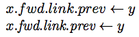
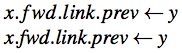
| ✔ | \(x.\textit{fwd}.\textit{link}.\textit{prev} \gets y\) |
→ | x.fwd.link.prev ← y |
\newcommand{\V}[1]{\textit{#1}} |
|||
| ✔ | \(x.\V{fwd}.\V{link}.\V{prev} \gets y\) |
→ | x.fwd.link.prev ← y |
| ✔ | \(\V{SD} = 10\) |
→ | SD = 10 |
These images show how LaTeX typesets the “wrong” and “right” examples in Computer Modern and Times fonts—not as dramatic, but still bad, especially around the f:
|
|
Type vertical bars as | for absolute values, but as
\mid for set comprehensions. \mid adds required
spacing.
| X | \(S = \{x | |x| < 5\}\) |
→ | S = {x||x| < 5} |
| ✔ | \(S = \{x \mid |x| < 5\}\) |
→ | S = {x | |x| < 5} |
Take a religious text of your choice, in Latin script, and find the name of a deity. How’s it printed? Perhaps in ALL CAPITALS, perhaps in Caps and Small Caps, but I bet not in a Different Font. Frequent font changes would look silly and distract from the message of the text.
What’s good enough for deities is good enough for you. Use the main body font for the name of your system.
| X | Our system is called DONGULATOR. |
| ✔ | Our system is called DONGULATOR. |
It is best to use the main body font for everything, except possibly code fragments (where typewriter text is acceptable). Even italics can be distracting; default to roman, with caps or small caps if you really must.
| X | The Dongulator server speaks Dongulation over TCP/IP to DONGLE clients. |
| ✔ | The Dongulator server speaks Dongulation over TCP/IP to DONGLE clients. |
Typeset negative numbers in math mode. This will give them the proper minus signs they deserve. Hyphens are too short.
| X | Pick a number between -1 and 1. Yuck. |
→ | Pick a number between -1 and 1. Yuck. |
| ✔ | Pick a number between \(-1\) and 1. Good! |
→ | Pick a number between −1 and 1. Good! |
Typeset ordinal suffixes in normal Roman text, not italics or superscripts.
| X | Invert the \(1^{st}\) through \(i^{th}\) elements. |
→ | Invert the 1st through ith elements. |
| ✔ | Invert the 1st through \(i\)th elements. |
→ | Invert the 1st through ith elements. |
Style guides like The Chicago Manual of Style agree that ordinal suffixes belong in normal text.
If you feel strongly about superscript ordinals, at least put them in
the body font (see mathptmx) and in Roman. Use
\textsuperscript or the
amsmath package’s useful \text.
Invert the 1\textsuperscript{st} through \(i\)\textsuperscript{th} elements. |
→ | Invert the 1st through ith elements. |
|
Invert the \(1^\text{st}\) through \(i^\text{th}\) elements. |
→ | Invert the 1st through ith elements. |
Hat tip: Ivan Savov
Most occurrences of the double-quote character " in
LaTeX text are bugs. TeX wants quotes written ``like this'':
doubled ` characters for open quotes and doubled
' straight apostrophes for close quotes.
| X | "This looks bad when typeset," said Betty. "Weird." |
→ | ”This looks bad when typeset,” said Betty. ”Weird.” |
| ✔ | ``This'll look better, `Babe,'{}'' said Tyrone. |
→ | “This’ll look better, ‘Babe,’” said Tyrone. |
Only use the " character in typewriter font or other
special situations.
Numeric ranges require unspaced en dashes, not hyphens (which are too short), minus signs (which are too long, too spaced, and semantically wrong), or ellipses. Or just use English prepositions.
| X | Lines 1-3 present our results. |
→ | Lines 1-3 present our results. |
| X | Lines \(1-3\) present our results. |
→ | Lines 1 − 3 present our results. |
| X | Lines 1..3 present our results. |
→ | Lines 1..3 present our results. |
| X | Lines 1 -- 3 present our results. |
→ | Lines 1 – 3 present our results. |
| ✔ | Lines 1--3 present our results. |
→ | Lines 1–3 present our results. |
| ✔ | Lines 1 to~3 present our results. |
→ | Lines 1 to 3 present our results. |
Fix reference capitalization errors with braces. The Bibtex reference processor ignores user capitalization in paper titles. For example, a Bibtex entry like this:
X @inproceedings{... title = "Improving NFA-based signature matching" ...}
might appear like this:
[48] ... Improving nfa-based signature matching ...Note the lowercase “nfa”: not what you want. Add extra braces and Bibtex will obey your capitalization.
✔ @inproceedings{... title = "Improving {NFA}-based signature matching" ...}
References are not nouns. They aren’t even parts of speech: when reading a paper out loud, you wouldn’t read the reference numbers. (Mary-Claire van Leunen’s A Handbook for Scholars is eloquent on this.) So don’t say:
X In [15] modern disk drives are shown to be effective.
X [1] applies cache-aware algorithms to binary search trees.
Reword the sentences, for instance to name the authors.
✔ Modern disk drives are effective [15].
✔ Cormen et al. [1] apply cache-aware algorithms to binary search trees.
Some sentences are difficult to reword, but at least make an effort. Beginning sentences with references is particularly egregious.
Commas that group digits in large numbers must not be spaced. This takes some effort in math mode: use braces or TeX will treat the commas like argument separators.
| ✔ | That cost \$2,000,000. |
→ | That cost $2,000,000. |
| X | That cost \(\$2,000,000\). |
→ | That cost $2, 000, 000. |
| ✔ | That cost \(\$2{,}000{,}000\). |
→ | That cost $2,000,000. |
Verbatim blocks belong in paragraphs of their own. If you continue a paragraph immediately after a verbatim block, the normal paragraph will use the verbatim block’s spacing, which is usually wrong.
| X | Look:
\begin{verbatim}
Test
\end{verbatim}
I forgot to start a new paragraph,
spacing gets weird. |
→ | Look: Test |
| ✔ | Look:
\begin{verbatim}
Test
\end{verbatim}
\noindent This should be better. I used
\verb+\noindent+ to avoid the paragraph
indent. |
→ |
|
Hat tip: John Regehr